15.3.1 Background
A marketing and advertising council was established to work towards the goal of improving the image and awareness of Rochester University throughout the community. One major aspect of such an initiative is to ensure that the College is presenting itself with a consistent image, which helps alleviate confusion and makes marketing more effective. One of the foundational issues of a consistent marketing program is the proper usage of an organization’s logo. Therefore, one of the first agenda items dealt with by the Communication and Advertising Council related to the use of the College logos.
Most colleges and universities have three logos each specified for certain uses: (1) a school seal – used for high-level official documents that originate from the President’s office or the Board of Trustees and which is also used on diplomas and academic transcripts, (2) a sports logo - used on athletic associated materials, and (3) a general logo – used for all other circumstances not covered in #1 or #2. This ensures consistency in the manner that the institution is presented to the community. The Communication and Advertising Council discussed this issue and decided it would be in the best interest of Rochester University to follow such practice.
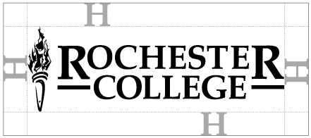
The Council decided to use a logo that incorporated existing items already used by the college. The logo (shown on next page) will serve as the general logo for the College. The torch serves to symbolize knowledge and Christianity as the light of the world. While many other schools incorporate a torch in their logo, the Rochester University torch is distinctive with much detail in the flames and an abstract impressionistic handle. However, even with its distinct qualities the torch is not able to stand on its own. Therefore, it should be used in conjunction with the Rochester University lettering to build a connection between the symbols.
15.3.2 Use of Name
Our official name is Rochester University. There is no “The” in front of Rochester University. Rochester University may be shortened in limited capacity by using the initial RC.
15.3.3 Official Color
Crimson is the official color of Rochester University. Use of other colors in conjunction with crimson are restricted to black and white.
| Pantone Matching System [PMS] |
CMYK |
| The crimson color is also known as Pantone 1865 |
The CMYK values for this color are: C 23, M 100, Y 100, K 18. |
| RGB |
HTML |
| The RGB values for this color are: R 165, G 30, B 34. |
The HTML values for this color are: Web #990033 |
15.3.4 Use of Logo
General Logo:
The logo consists of two parts, the torch and the wordmark/typeface, and the parts should never be separated. Traditionally, the torch symbolizes light in darkness. For Rochester University, this has two meanings: (1) enlightenment through education, such that one grows intellectually and is able to connect coherently the truth of God with the wisdom of humanity; and (2) a beacon of Christian hope, cast across a world that is searching for salvation.
The logo is to be used in all external and internal communications, media, and collateral materials. When individuals officially represent Rochester University the logo should be used in all communications, digital and printed.

| Black-and-white version |
Crimson-and-white version |
The following list is not comprehensive but serves to demonstrate where the general logo should be used:
- Letterhead
- Envelopes
- All marketing materials (brochures, announcements, advertisements, pamphlets)
- College paraphernalia (coffee cups, stationery, shirts, pens, etc.)
- All office forms
- Fax cover sheets
- Memo templates
- PowerPoint slides
- Awards
- Announcements
- Etcetera
Other general restrictions
Do not color the College Logo in any color other than crimson. In rare instances CS may make an exception due to limited color being used in a print piece.
Do not stretch or distort the proportions of the logos in any way. This can be avoided by scaling the logos uniformly, or scaling by percentage.
The college logo should never be reproduced smaller than 1 5/8”
When the college logo is used with other design elements such as typography, illustrations, or photography, the logo must maintain a minimum “clear zone”, or space around itself. That space is judged by the height of the letter “H” in the logo.

College Seal
The seal of Rochester University is the official emblem of the institution. As such, from this point on its use shall be restricted to diplomas, official transcripts and formal documents of Rochester University that originate from the Office of the President and/or the Board of Trustees.

| Black-and-white version |
Crimson-and-white version |
The Interlocking RC
The Interlocking RC logo will be used by the athletic department as an alternative to the general logo. Other departments may use the Interlocking RC logo but must gain permission from the Communication Services Department.

| Crimson-black-white version |
Black-and-white version |
Crimson-and-white version |